
The organization of co-design workshops is an essential and indispensable milestone in a digital project. These workshops have two main advantages:
- They make project management more fluid thanks to closer collaboration between the client and the project team. This limits misunderstandings and therefore iterations. In addition, it makes it easier for the client to share with the project team his vision of an “experience” that is unique, sometimes innovative, but in any case representative of his brand identity.
- They can also be part of user-centred design methods if these workshops involve (actual or potential) end users of the product, or if they involve them indirectly, in particular through the knowledge of the participants (UX/UI designer and the client, of course).
This last point raises the following question: as designers of digital services, do we have sufficient knowledge of users to be able to avoid involving them, whether in person (focus groups, user tests, interviews, card sorting, etc.) or remotely (analytics, surveys, A/B testing, etc.)? This question is valid for us, as designers, as well as for our clients or silent partners.
In order to try to answer this question, we propose some data from experiments that we have conducted in the context of courses or conferences that we sometimes facilitate. These results cover 70 participants from different groups of students or digital professionals in France (the results presented are rounded).
Is common sense enough to design a good UX?
Experiment 1
We asked our panel the following questions:
- Do you think that with common sense, we can design a good user experience?
Yes / No
- Do you think you have any common sense?
Yes / No
Results
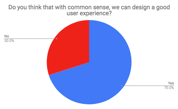
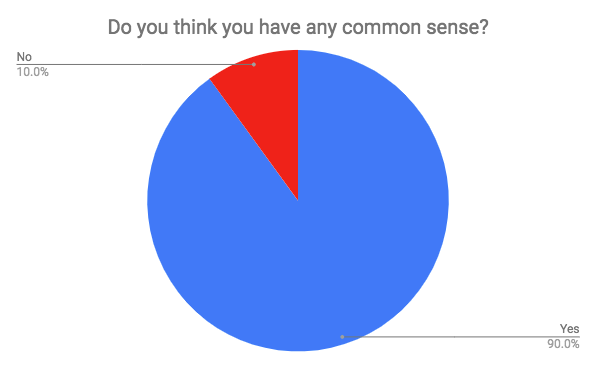
The results indicate that the majority of digital players believe that common sense is sufficient to design a good user experience. As they also claim this quality, the design of digital services should not be a problem. Unfortunately, it seems that this apparent ease does not stand to the test of the data.
Beware of common sense
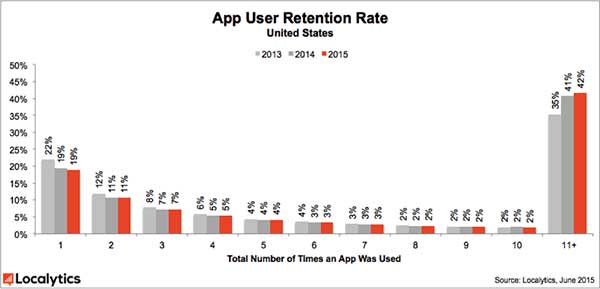
The graph below shows the retention rate of mobile applications. By retention rate, we mean the percentage of mobile apps used 11 times or more by their users (in any case, this is the threshold used by Localytics to consider an application as adopted).
Two observations can be made:
- Only 34% of the applications in the world in 2015 were used 11 times or more by their users.
- But more importantly, 51% (25% + 12% + 8% + 6%) of the applications were used 4 times (maximum) before being uninstalled or ending up in the SD card limbo of our smartphones.
However, the people who designed these applications should not lack common sense: developers, marketers, or designers, they have committed significant resources to design these services and make them available to potential users on the “app stores”. And despite this, only the third of the applications have been sustainably adopted. Could it be that we have been fooled ourselves by our “common sense”?
The illustration below shows this. With a little common sense, we can only be convinced that the Earth is flat and that the sun revolves around it.

However, reality is more complex, as science has shown. For users, it’s the same: their complexity often exceeds the apparent knowledge we think we have of them.
Fortunately, there is logic. Logic is taught in universities, it is both mathematics and syllogisms (clause like IF… THEN) which are at the origin of algorithms, themselves being the basis of computing and therefore, of the digital technologies for which we do this job !
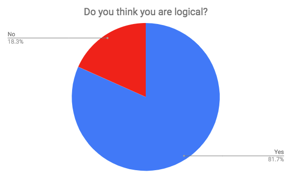
Is logic enough to design a good UX?
Experiment 2
The second experiment is as follows. From the same sample as before, we asked the following questions.
- Do you think you are logical?
Yes/No
- Do you think users are logical?
Yes/No
Results
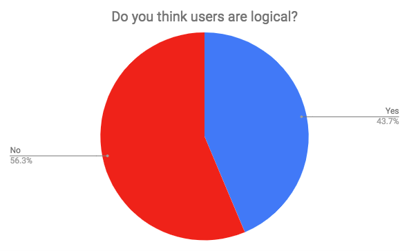
We could also have asked participants if they were users themselves. We didn’t do it because we knew the answer insofar as to answer our questions, they used a digital service (google form) via their own computer or smartphone, and connected to the Internet…
The results are eloquent and illustrate a cognitive bias. Here, the respondents consider themselves more “logical” than an other group, while neglecting the fact that they are also part of it. We may wonder about our ability (we mean us, service designers, as well as our clients) to project ourselves into the functioning of users if we underestimate them so much. However, we do it every day, with the certainty of doing it in the most objective way….
In the end, we may wonder if users are “logical” (at least as much as we are), and if so, if it would be possible for us, designers of digital services, to use this logic to offer them applications that they will certainly adopt.
Are we logical?
Experiment 3
To answer this question, we subjected the participants to the experiment of Wason (1966). It consists in showing 4 cards with a number on one side and a letter on the other, but only one side is visible. Participants must determine which cards to return (at least, and not one more) to determine if the following statement is true (or false):
“If an A is on one side, then there’s a 3 on the other side”

We’ll let you think a little more before we give you the answer….
Results
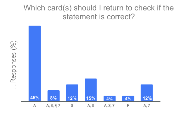
You have returned the A or A and the 3, congratulations, you are among the 60% of the most predictable people, as well as the author of these lines! Original or not in their answers, 90% of people fail this test. However, as Alain Lieury mentions in his famous handbook, it is not related to level of education, because these results are also found in PhD. holders. Only people with expertise in mathematics or technical sciences barely reach 50% success, which is not yet very high.
We had to answer A and 7 (12% of the answers from our panel). Explanations :
- We need to flip the A to see if there’s a 3.
- Nothing is said about the F, so there is no need to return it.
- The 3 is more complicated: the instruction says that there must be a 3 on the other side if an A is on one side. However, it is not impossible that a 3 may also be behind another letter. For the letter A, it is necessarily a 3, but for the other letters, nothing is specified. It is therefore allowed by default. A 3 can therefore be found behind a B.
- Why do we have to return the 7? Because if we saw an A on the other side, we would make the instruction lie, and thus check its veracity.
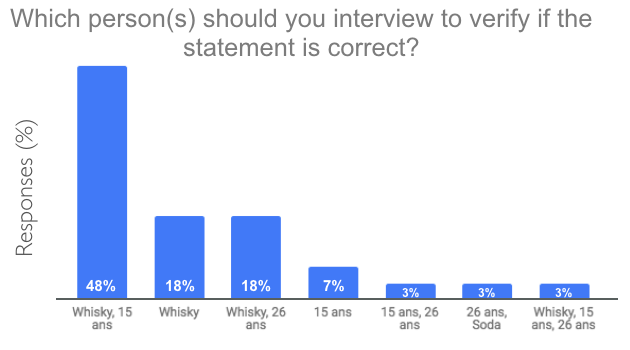
Experiment 4
Let us now proceed with the same experiment, but presented differently, as proposed by Griggs and Cox in 1982. This is exactly the same test as before. The level of difficulty is identical to that of Wason’s experience. Only the presentation of the task changes. They ask participants to determine which character(s) to question about their age or the content of their glass to ensure that the following statement is correct:
“If a person drinks alcohol, then he or she must be over 18 years of age.”

Results
The correct answer is whisky and 15 years old. It is necessary to control the age of the whisky drinker and the glass of the minor. A person of 26 can drink what he want, and a soda can be drunk at any age. This is how 48% of our panel succeeded this time in this selection task.
Logic vs. user-centered design
The conclusion of this case study is that we are not logical. We, it means everyone. designers, ergonomists, consultants, designers, developers, marketers, project managers, writers, art directors, clients, users, etc. So it is pointless to rely on any logic to develop a digital service.
On the other hand, if we know how users “work”, we can make them do a very complex task very easily, just by adapting the way we present them. It is only a question of knowing and understanding the users. Understand their needs, ways of doing things, preferences, and contexts. If this is possible through introspection and empathy, the examples provided here show that our thinking is often biased. Although that they may still be true, it is still essential to give ourselves the means to ensure this by basing our choices on a truly user-centered design method. This implies involving “them”, the users (actual or potential, i.e. those who are not themselves service designers).
When we invoke “logic” to justify a choice of service design (e.g.: “we will present it like that, because it is more logical”, “logic would like that…”, “it is not logical”), we deny this need for user-centered design. We avoid verifying a design choice considered true because it is “logical” or “common sense”. In fact, whenever we ask ouselves the relevance of a choice for the design of a service, we should always ask ourselves if users will be satisfied using it. And if the answer is because it’s “logical”, it’s because we have not yet found the right explanation for our choice!